What I liked, what I didn’t, and why none of them were quite right.
I’ve been writing on and off for twenty years and developing software for longer. I’ve tried most of the writing apps you’ve heard of and several you haven’t. Some of them are very good. None of them were right for me, and it took a long time to understand why.
This isn’t a features comparison. There are plenty of those. This is what it actually felt like to sit down and try to write in each one.
Microsoft Word
microsoft.com/microsoft-365 | From $99.99/yr, £84.99/yr, €99/yr (Microsoft 365 Personal)
Where most of us start. Where most of us stay longer than we should.
Word is built for documents, not for writing. There’s a difference. The toolbar alone has more options than I’ll use in a lifetime. Margins, headers, page numbers, track changes, comment bubbles. I’d open it to write a chapter and spend ten minutes adjusting the view before typing a word. Yes, Focus Mode exists. It hides the ribbon and gives you a cleaner view. But bolting a calm room onto the front of a factory doesn’t make it a writing tool.
The page feels clinical. White rectangle, black text, blinking cursor. No warmth, no personality. It’s paper on a screen, and not particularly good paper.
What it does well: track changes is genuinely useful when working with an editor, and the file format is the lingua franca of publishing. But for the act of writing? For sitting down with a blank page and trying to make words happen? It’s the wrong room.
Google Docs
docs.google.com | Free
I had access to it, so I used it for a while. It’s convenient. No install, no file management, just a browser tab.
But I never got comfortable writing fiction in a browser. The page felt flat, more like a spreadsheet with better fonts than a place to do creative work. And I could never shake the sense that my writing lived on someone else’s computer, in someone else’s tab, one accidental close away from breaking my train of thought.
Scrivener
literatureandlatte.com | $59.99/£59.99/€69.99 one-time
The one everyone recommends. The one I wanted to love.
Scrivener is powerful. The binder, the corkboard, the inspector, the ability to organise your manuscript into scenes and chapters and move them around. For writers who plan extensively, who outline before they draft, it’s built for exactly that.
My problem was that I’m not that writer. I’m a discovery writer. I find the story by writing it, not by planning it. I don’t know where a chapter belongs until I’ve written the chapters around it. Scrivener wanted me to organise first and write second, and that stopped me cold. I’d open it, see the empty folders and the structure waiting to be filled in, and close it. The app became another thing to manage instead of a place to write.
There’s a real need for the organisational side of novel writing, things like worldbuilding, character tracking, plot structure. Tools like Obsidian fill some of that gap, though none of them do it in a way that feels native to fiction. It’s a fascinating problem, and one I’d love to take a proper run at someday.
When I did get past the setup and actually wrote in Scrivener, the writing surface was fine. Clean enough. But “fine” is a low bar for the place where you spend the most important hours of your creative work.
No AI, no subscription. Those are real strengths. If you’re a plotter, if structure helps you think, Scrivener might be exactly what you need. It just wasn’t what I needed.
Ulysses
ulysses.app | $5.99/£5.99/€5.99 per month, Mac and iOS only
Beautiful app. The best-looking writing experience on the Mac for a long time.
I loved the library. Everything in one place, organised by groups, searchable, synced across devices. The Markdown editor is clean and well-made. Publishing to WordPress directly from the app is clever. The writing experience is pleasant.
Two things pushed me away. The first is the subscription. We live in a world now where everything is a monthly payment, designed to feel cheap in the moment but adding up to far more in the long run. Open your bank statement and count the direct debits. It’s exhausting. And a writing app is the worst place for it. During a dry spell, the subscription made me feel guilty for not opening the app. During a productive stretch, I’d wonder whether I was writing because I wanted to or because I was trying to justify the cost. A creative tool shouldn’t carry that weight.
The second thing is harder to pin down. Ulysses is a very good container for writing. But the page itself, the moment of sitting down and typing, felt the same as every other app. Clean, minimal, static. The words went in and sat there. Nothing about the environment made me want to stay longer or come back sooner.
iA Writer
ia.net/writer | $49.99/£49.99/€49.99 one-time (Mac), $29.99 (Windows)
The purest of the minimal editors. iA Writer strips everything away until there’s nothing left but text.
It’s opinionated in ways I respect. A small set of carefully chosen fonts. No formatting toolbar. Focus mode dims everything except the sentence you’re writing. The design is rigorous and the philosophy is clear: fewer distractions, better writing.
I have a lot of time for iA Writer. Their stance on AI, building Authorship to expose machine-written text instead of generating it, is the most thoughtful response any writing app has made.
But iA Writer is a Markdown editor, and it asks you to think that way. You’re writing in a syntax, not on a page. For developers and technical writers that’s natural. For a novelist who just wants to sit down and write a scene, it’s a layer of friction between you and the words. The writing should feel like writing, not like formatting.
The deeper issue is what kind of minimal it is. iA Writer’s minimalism is clinical. Everything has been removed, and you feel the absence. The page is stark, the cursor blinks, and you’re conscious of the emptiness in a way that puts you on edge rather than putting you at ease. Both iA Writer and Reverie are minimal. But there’s a difference between a room that’s been stripped bare and a room that’s so well considered you settle into it without thinking. One leaves you alert and aware of yourself. The other lets you relax. And when you’re relaxed, the words come easier. Not because of anything the app is doing. Because your guard is down.
What I actually wanted
After years of switching apps I could finally name the thing that was missing from all of them. Not a feature. A feeling.
Every app gave me a surface to write on. None of them made me want to stay there. On the hard days, the days when the blank page wins, every editor felt the same. Static, clinical, indifferent. The cursor blinked. I stared at it. I closed the app.
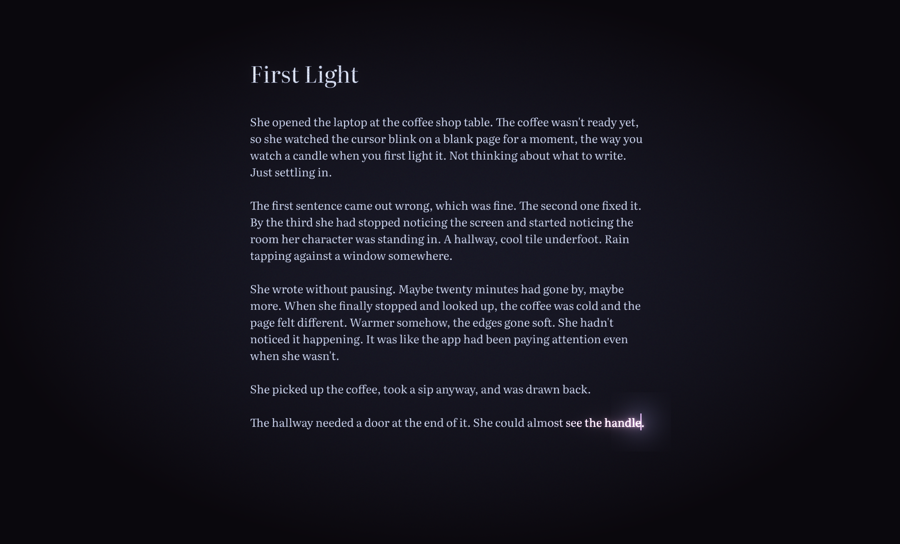
I wanted a page that met me halfway. Not with suggestions or AI or gamification. Something subtler. A page that felt alive. That responded to the act of writing in a way I couldn’t quite put my finger on but could feel immediately when it was gone.
I wanted to open my draft and feel like I was continuing, not starting. I wanted the app to know when the words were flowing and to quietly, invisibly, make the room a little warmer. I wanted to look up after twenty minutes and not know where the time went.
No app I tried did this. Not because they were bad. Because nobody was trying.
So I built Reverie.
— Mark